INSIDE ARAMNESS | AUGUST 15, 2021
“Something that has always amazed me about the wildlife and people of Gir, is the harmonious and symbiotic relationship of its wildlife and its people. And so, we are committed to ensuring that Aramness, the lodge and its impact, also exists in harmony with its surroundings,” explains Jimmy Patel, our founder.
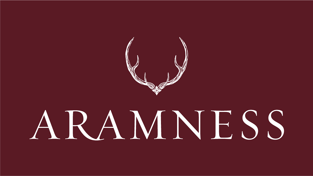
Marina Greaves and Christopher Gough Palmer of The New Black were entrusted to bring the Aramness brand identity to life. Our values, the environment and the wildlife were the source of inspiration for our visual identity and were instrumental in guiding the creative development of the logo. The two key elements of our logo: the antlers and the taara or star signify the physical environment and the emotional connection experienced by guests respectively. Aramness encourages authenticity and meaningful connections with India, its natural environment, its people and its culture. It’s this meaningful difference that inspired the design of the identity
The symmetrical three-pronged antlers are those of the chital or spotted deer, which is prolific in the Gir National Park and throughout the Indian subcontinent. The chital lives a family-oriented life in symbiosis with other wildlife such as birds and monkeys, cooperating for both food and safety. At Aramness, these are values that we identify with.
The taara is nestled at the base of the antlers and symbolises the cardinal directions of the traveller, providing direction for guests searching for a sanctuary, a place of rest and rejuvenation, or perhaps, a place where they can connect with something greater.
Beneath the antlers and taara is our wordmark: Aramness, which has its own purposeful design identity. The name is a union of two Gujarat words: aram (peace/ rest) and ness (local village) and represents a unique vision for a village style lodge. Luxurious and elegant serifed forms create the wordmark – proud but not arrogant, just like the brand itself. The generous letterspacing echoes the private and revitalising space that guests enjoy at the lodge, while the shared connection between the letters ‘A’ and ‘R’ illustrates the supportive relationship between the guest and the Aramness lodge experience.
“By brining all of these elements together in the most subtle of ways, we hoped to create a meaningful visual connection to the brand, its values and its beliefs,” says Marina.